
Good Brand Day: A Brand Studio’s Own Site — the Thing That Has to Prove You Can Design Things
A brand studio’s website is a self-referential trap: the work has to be the argument, but the site itself is also being judged as work. Good Brand Day is one senior practitioner with 15 years across communications, brand management, and creative — and a client roster including RoC, Caroline Hirons, and Skin Rocks. Envion designed and built goodbrandday.com in Framer on a single principle: work above services, always. Case-study cards carry the framing of each engagement, services compress to three verbs, the logo marquee lands exactly where the "is this real?" doubt peaks, and motion follows one rule — it only reveals, never decorates.

The challenge
The work has to be the argument, but the site itself is also being judged as work. Two specific constraints made it harder.
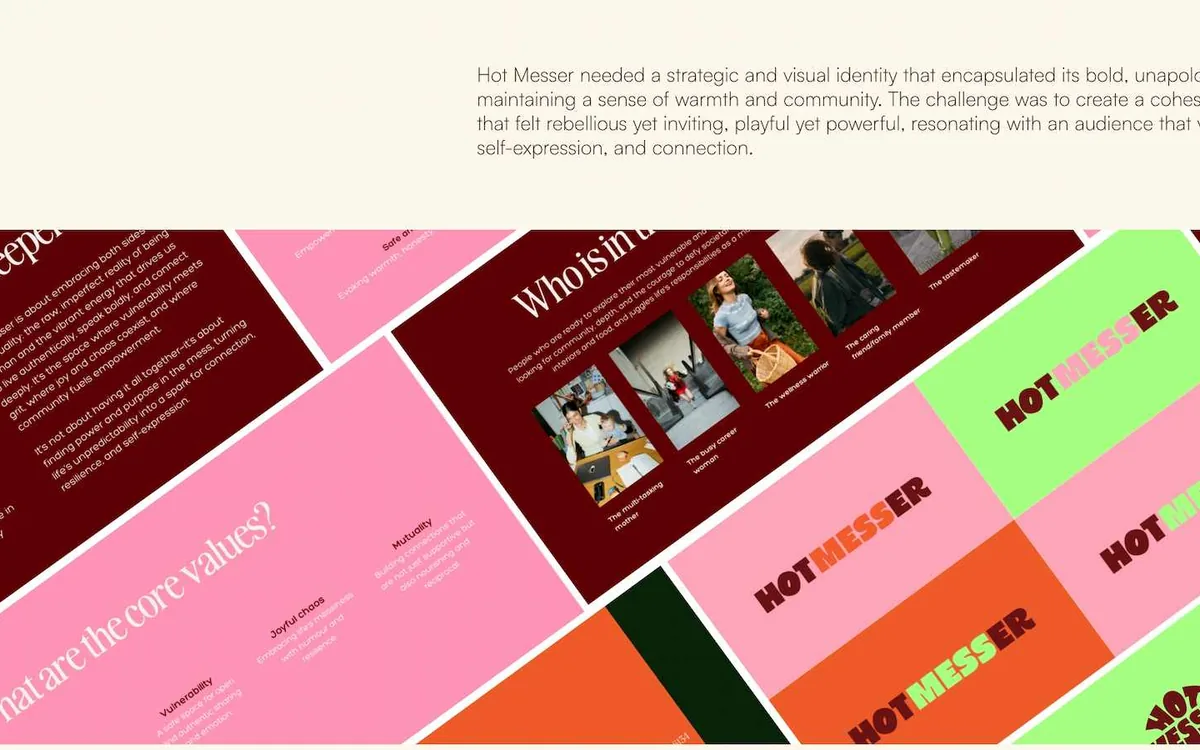
The studio is one senior practitioner with 15 years across communications, brand management, and creative — clients including RoC, Caroline Hirons, and Skin Rocks. A genuinely strong roster, but a site that oversells "studio" invites the question "how many of you are there?", while a site that reads as freelance undersells the client list. And range is a liability if presented as a list: the work spans packaging (a RoC lip volumiser PR mailer), full rebrands (Muihood, rooted in Traditional Chinese Medicine), brand-building from zero (Sleepgym, My Grandma's Kitchen, Hot Messer), and campaign creative direction (Skin Rocks, Caroline Hirons). Shown as a services menu, that reads as unfocused. Shown as work, it reads as versatile.
Decision path
An enquiry-source audit reframed the whole project: prospects were arriving from Instagram and referral, already partly sold, and needed the site to do one thing — confirm the work is real and get them to a conversation. The site's job is closing, not lead generation. Objection mapping identified the three unspoken objections — Is the work actually theirs? Can they do my category? Is this going to be a bad fit personality-wise? — and every section of the site answers one of them. A competitive scan of solo-principal studios showed a consistent failure: services-first homepages that force the visitor to read a taxonomy before seeing anything visual.
The information architecture is deliberately shallow — four destinations, one goal: Home (the argument, in one scroll), /works (the evidence), Services as an in-page anchor rather than a route (the mechanics), and Contact (the conversion). Services lives on-page because nobody hires a brand studio because of a services list, but they do want to check the engagement shape matches theirs — and as an anchor, it can't intercept someone on their way to the work.
Envion contribution
Envion owned IA, UX writing, the layout system, motion design, and the Framer build.
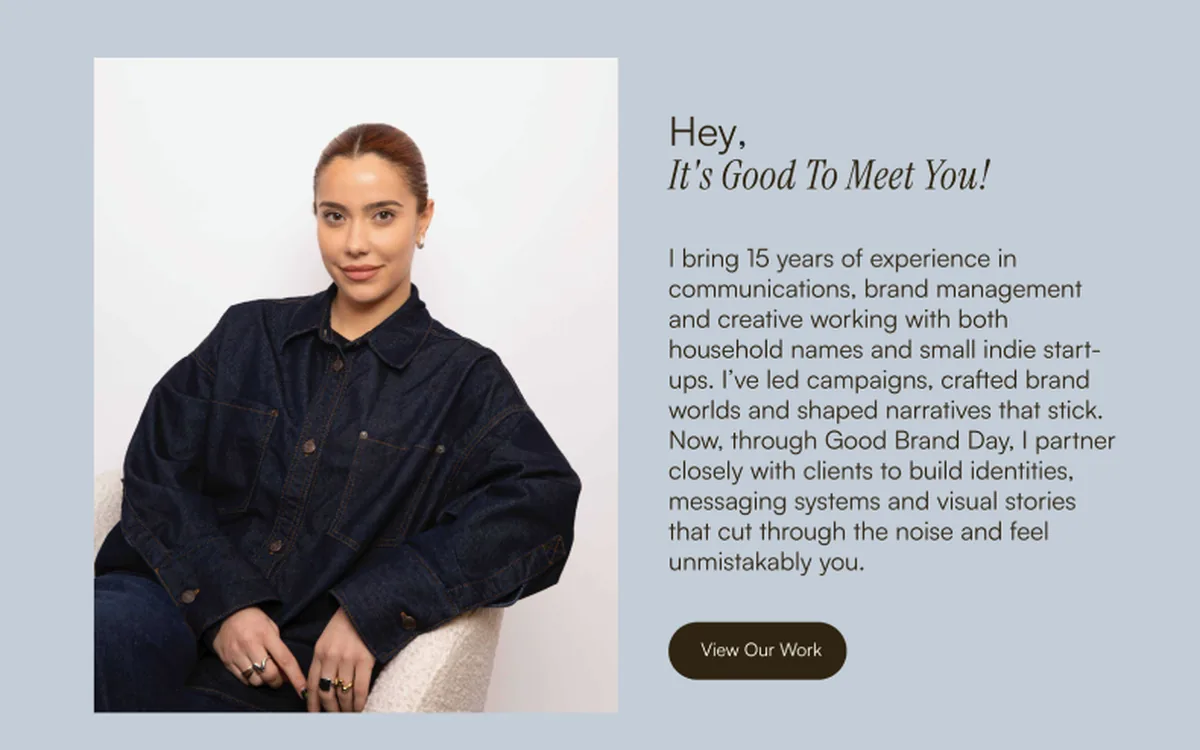
Key UI decisions: work above services, always — the homepage runs hero → case studies → client logos → services → about → CTA, with the case-study grid starting before the first scroll completes and View Our Work as the hero's primary button, because the enquiry audit said these visitors need confirmation before contact. Case-study cards carry the framing, not just the name — "Muihood — Rebranding a Holistic Skincare Brand Rooted in Traditional Chinese Medicine" answers "can they do my category?" through evidence. Three services compress to three verbs — Design, Build, Creative — each a single sentence mapping to a different budget and commitment level, so a prospect can self-qualify before the first email. The logo marquee sits between work and services, exactly where the "is this real?" doubt peaks. And the About is first-person with a face — "Hey, it's good to meet you!" — resolving the studio-vs-solo tension honestly: the site says "studio," the About says "I."
Delivery
Motion follows a rule, because Framer makes elaborate motion cheap — and that's the trap: motion only reveals, never decorates. Sections fade and rise on entry; nothing loops, nothing parallaxes, nothing delays the reader. On a portfolio site the work should be the only thing moving in the visitor's attention.
With no heavy graphic system of its own, the site leans on a large display face and generous whitespace — typography as the identity — so client work supplies all the colour. The site frames; it doesn't compete.
Outcome and evidence
The site is live at goodbrandday.com. Enquiry volume, home-to-works click-through, contact conversion, and case-study depth are measured in the studio's own analytics rather than asserted here.
The named next steps: build two or three case studies in full depth — problem, process, outcome, in the client's words; Muihood and RoC are the strongest candidates, one full rebrand and one blue-chip execution — and add a lightweight enquiry form with budget and timeline fields to pre-qualify before the first call.
The client’s website
The studio’s site, as shipped

Client feedback
What the client says about this engagement

“I was flabbergasted — in the best possible way. Envion moved quickly without ever compromising on quality. They seemed to dive straight into my imagination and surface with the design I had been dreaming of — only clearer, sharper, and unmistakably mine.”
Evidence gate. This page publishes only what Envion's project records and client disclosure permissions support. Outcomes are added once verified against a baseline, a measurement period, and an approved source.
FAQ
Questions about this case
Facing a similar challenge?
Your own site is the hardest brief in your portfolio. Envion designs the argument — work first, evidence placed where the doubt peaks, motion that knows its job.
Discuss a Similar ChallengeKeep exploring
Similar case studies


Executive Technology Leadership
Support for high-stakes product and AI decisions
Bring senior technology leadership into the business when the roadmap is unclear, delivery is at risk, an AI initiative needs stronger ownership, or the company needs an experienced technical voice before hiring a permanent CTO.
Discuss Interim CTO SupportCore responsibilities
- Align product and technology priorities with business goals and measurable outcomes.
- Review architecture, delivery risks, data foundations, security needs, and AI readiness.
- Lead internal teams and external partners through a practical execution plan.
- Clarify team structure, ownership, decision rights, and delivery cadence.
- Support investor, board, partner, and due-diligence conversations with credible technical judgment.
New experience
Prompt-to-Page — try it right here
Describe the landing page you want, in your own words. We turn it into a finished page and email you a private link in 5–10 minutes — no briefs, no calls, $0 to see the result.
- Describe what you want to create.
- We structure, write, and compose the page.
- You receive a private link when it is ready.
Start with a sentence — the interactive builder takes it from there.
Generate My PageSafe, respectful content only. No obligation.